Nimuki
The Context
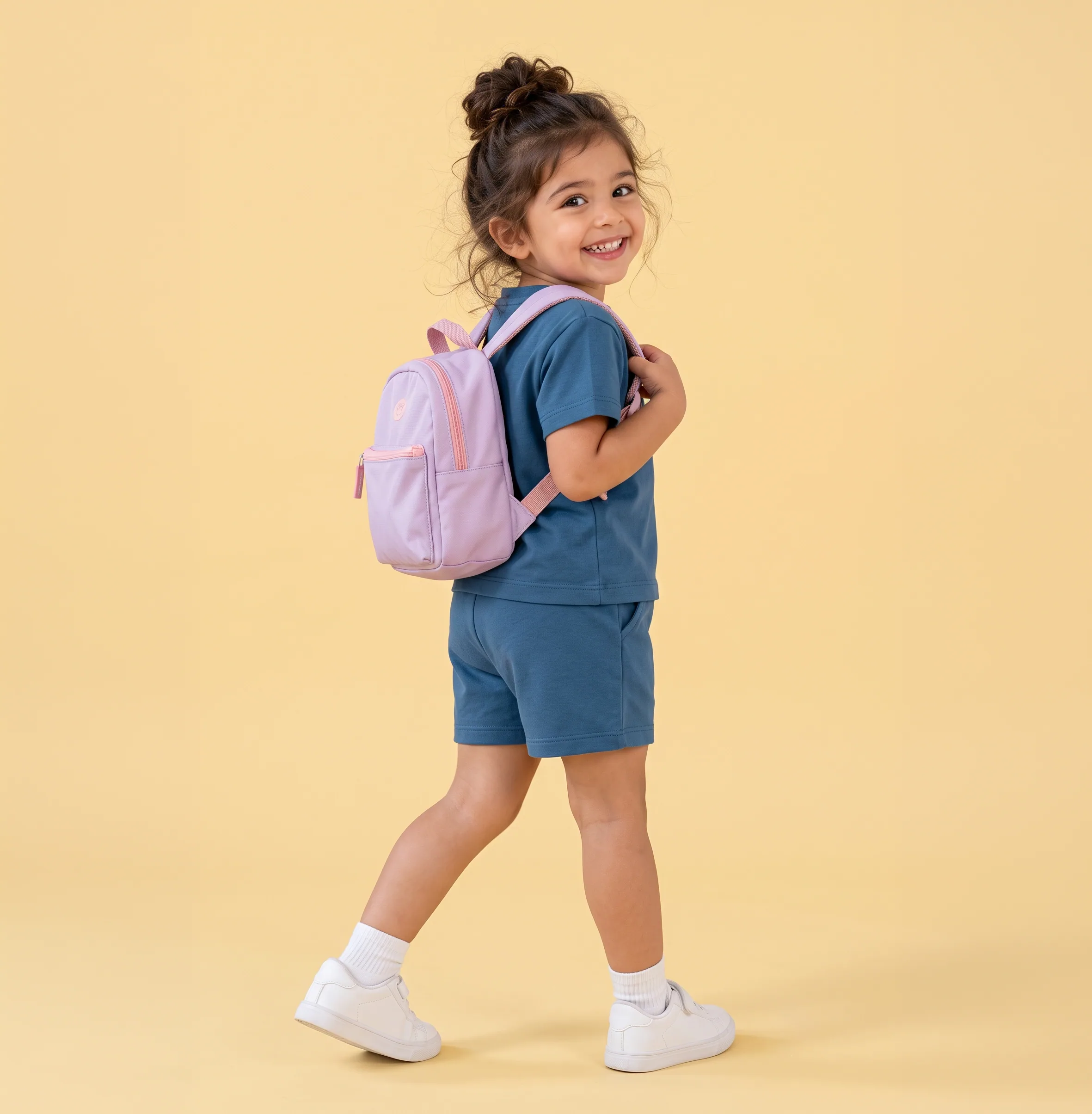
Nimuki is a kidswear brand built by a husband and wife, with Radhika leading it alongside the everyday inspiration of their young daughter. It began with one scratchy collar, one stubborn four-year-old, and no soft, honest clothes to be found on any shelf.
It needed a whole brand from the start: a logo with some joy in it, a look as soft as the clothes, and artwork small children would actually want to wear.
The Idea
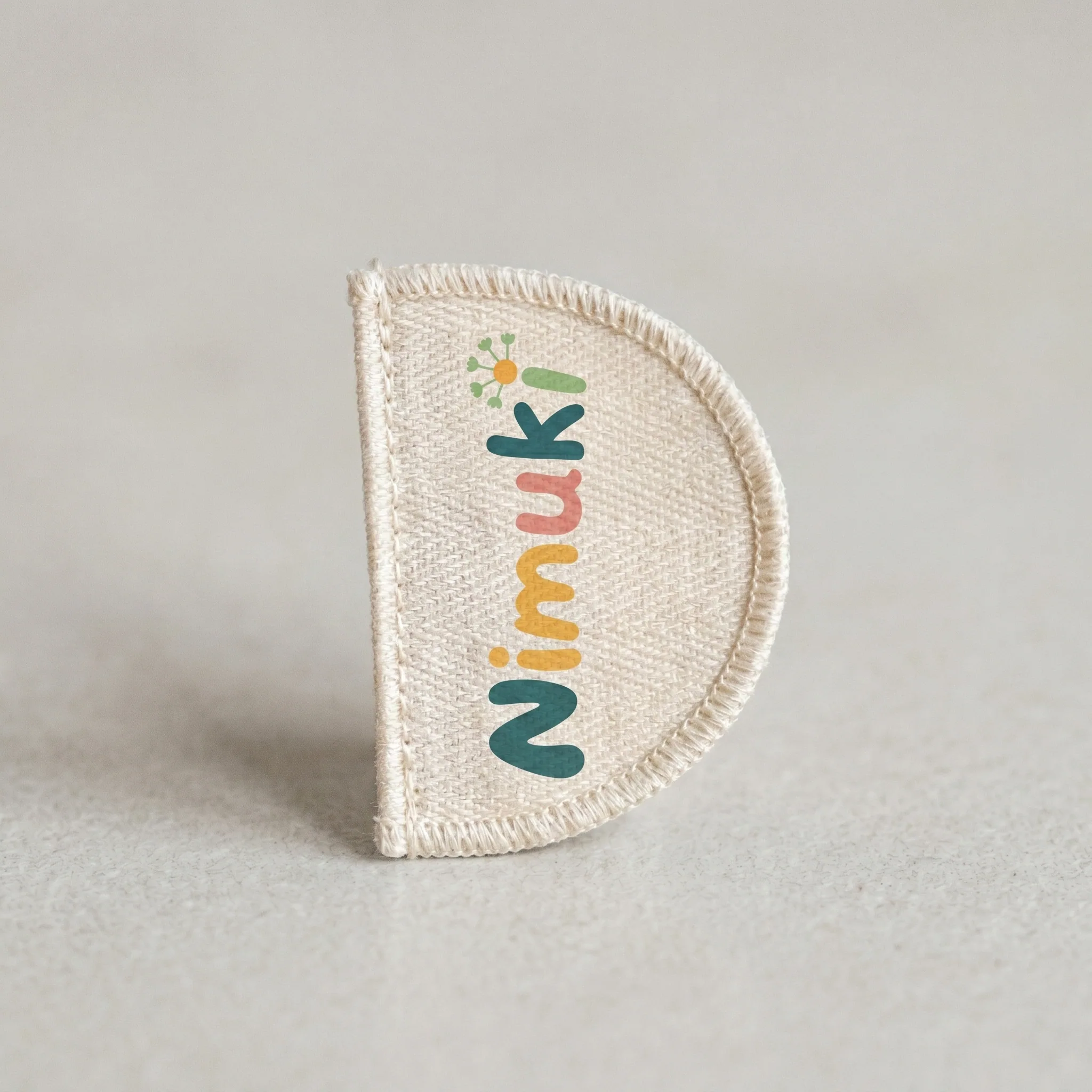
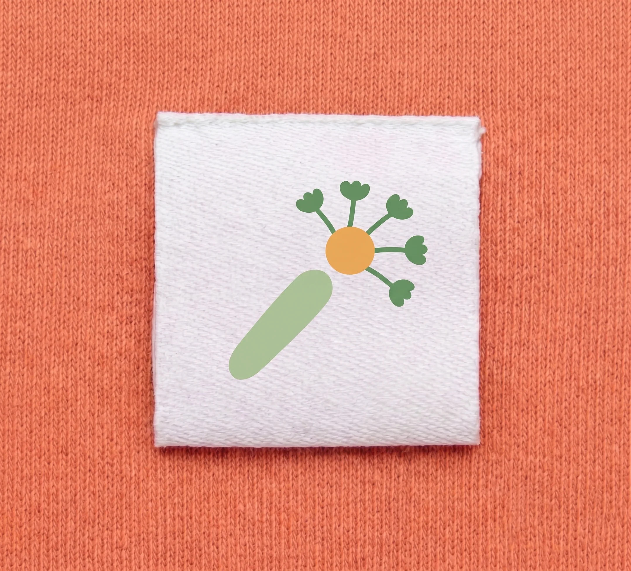
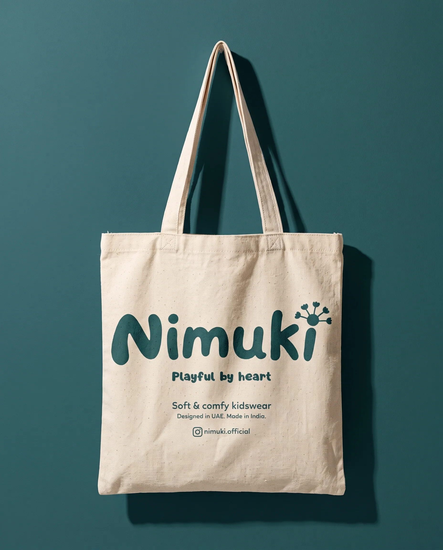
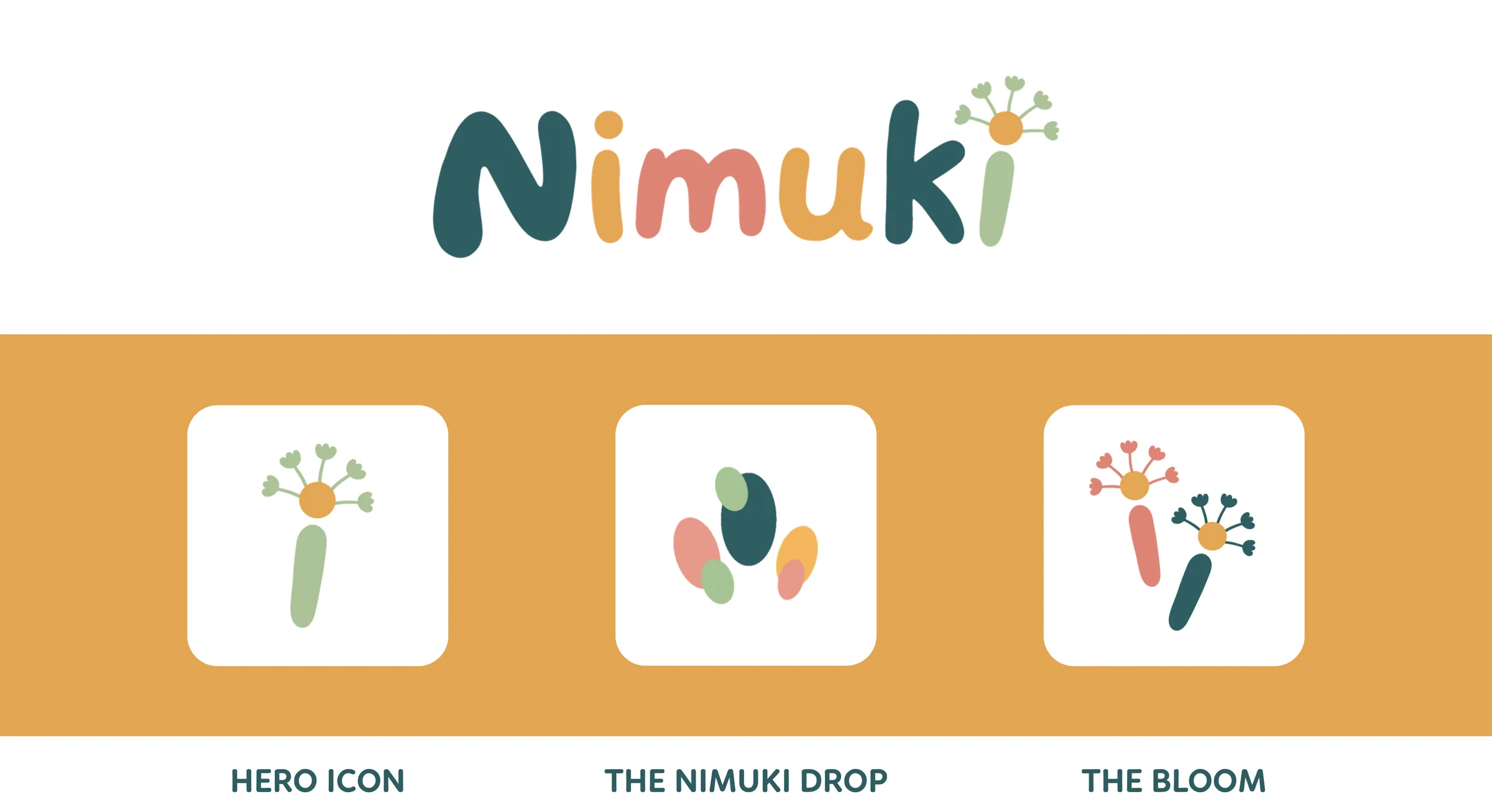
Nimuki means the playful magic of childhood. So the logo is drawn in round, bouncy letters, and the i in the name grows into a dandelion, the flower every child stops to blow on.
The Solution
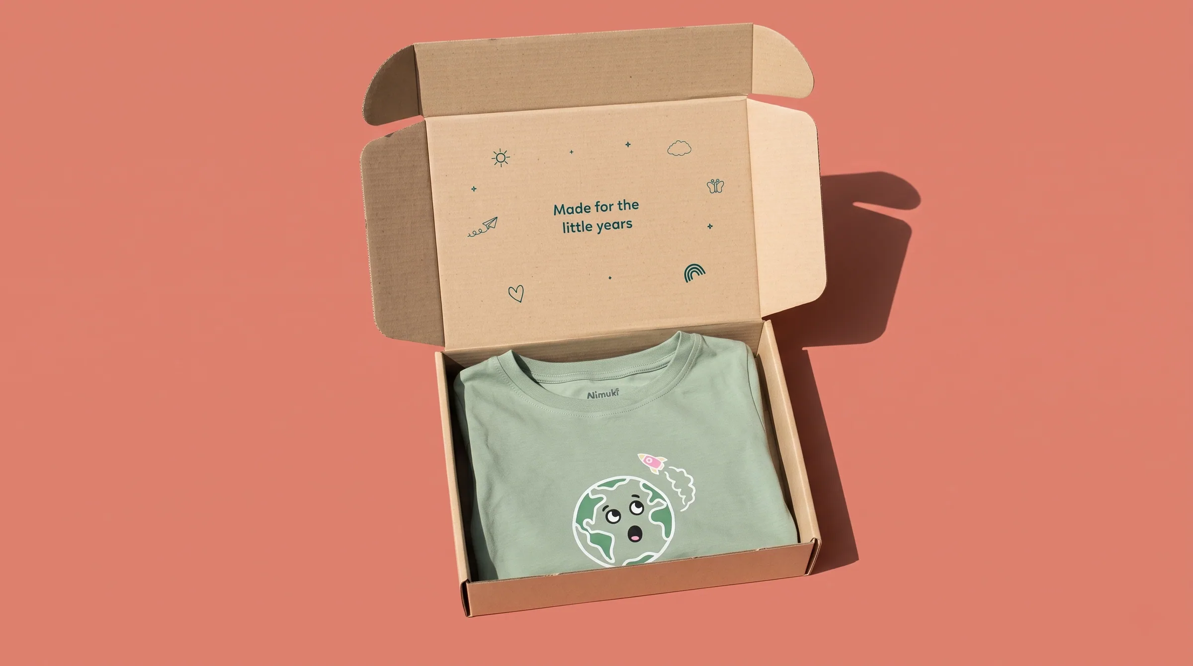
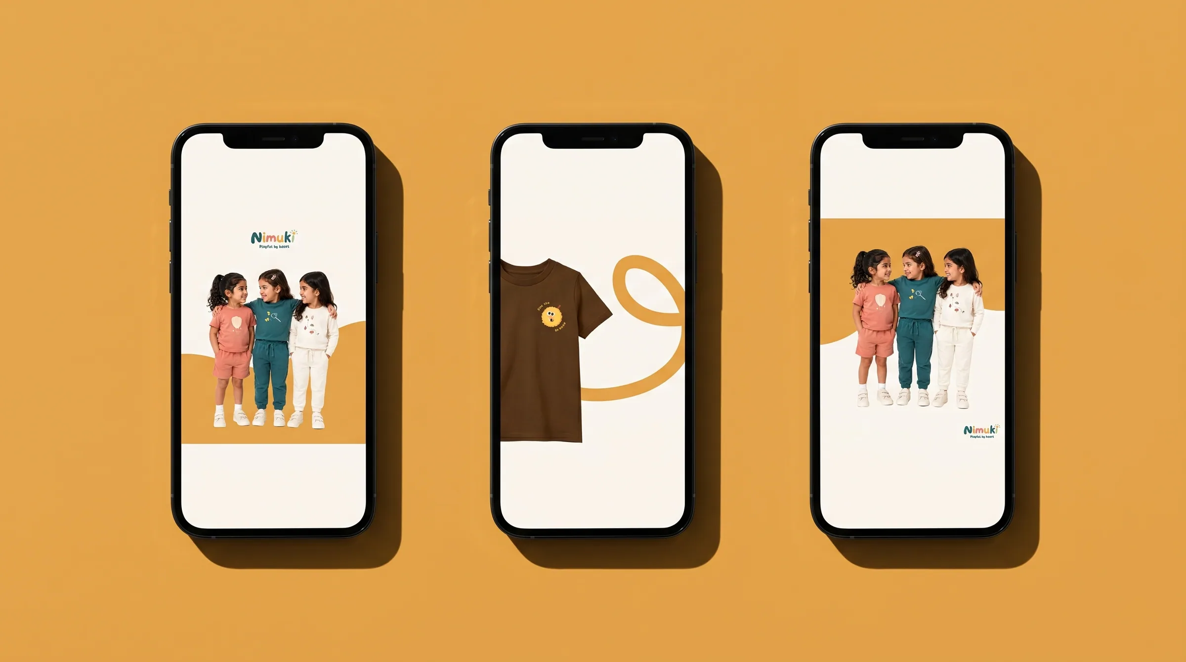
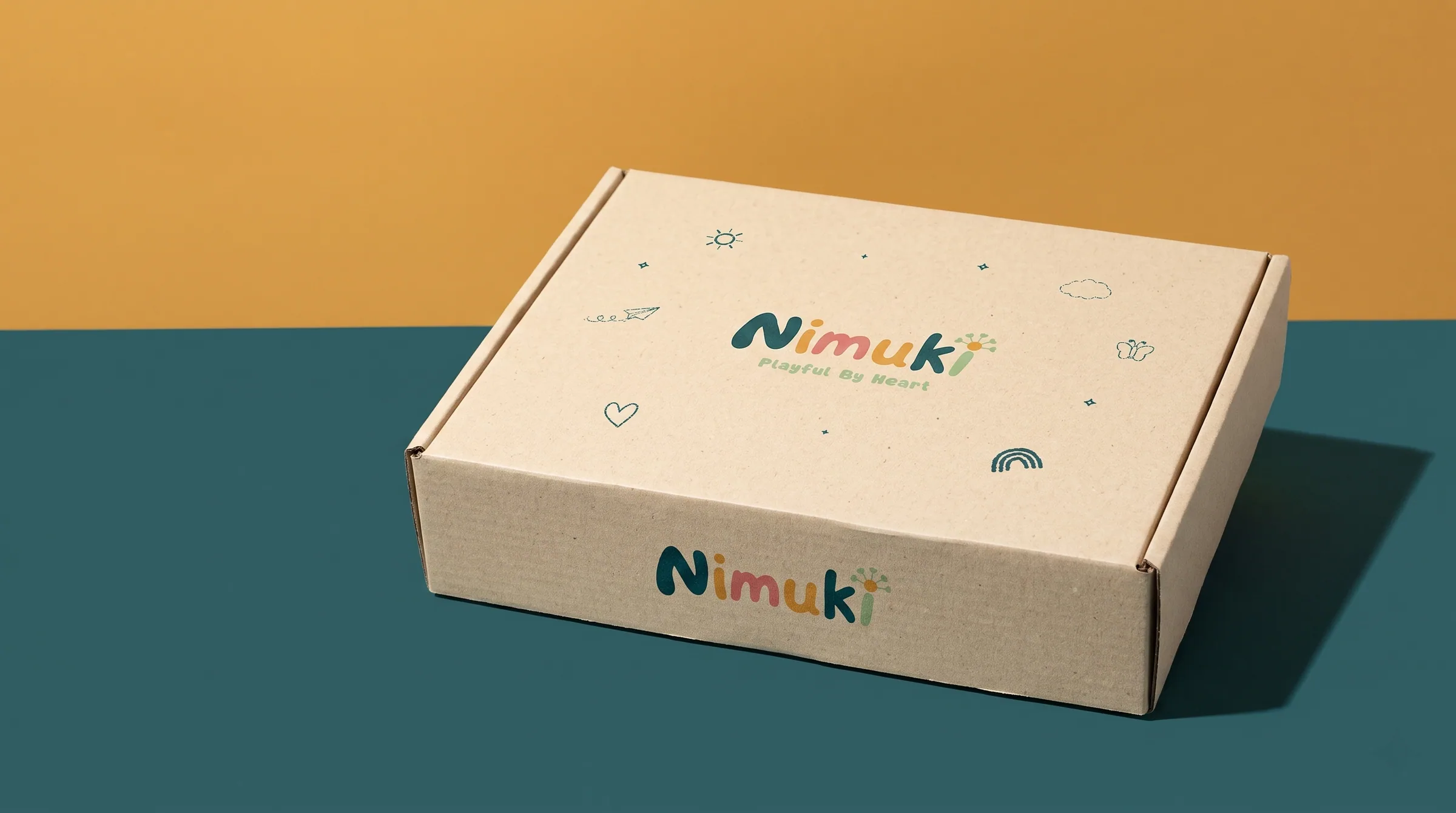
Warm cream, oat, mustard, peach and sage, with deep teal to anchor them, keep everything gentle and easy to live with. The dandelion and a small pebble pattern carry from labels and tags to the mailer box, where the lid opens on one line: made for the little years.
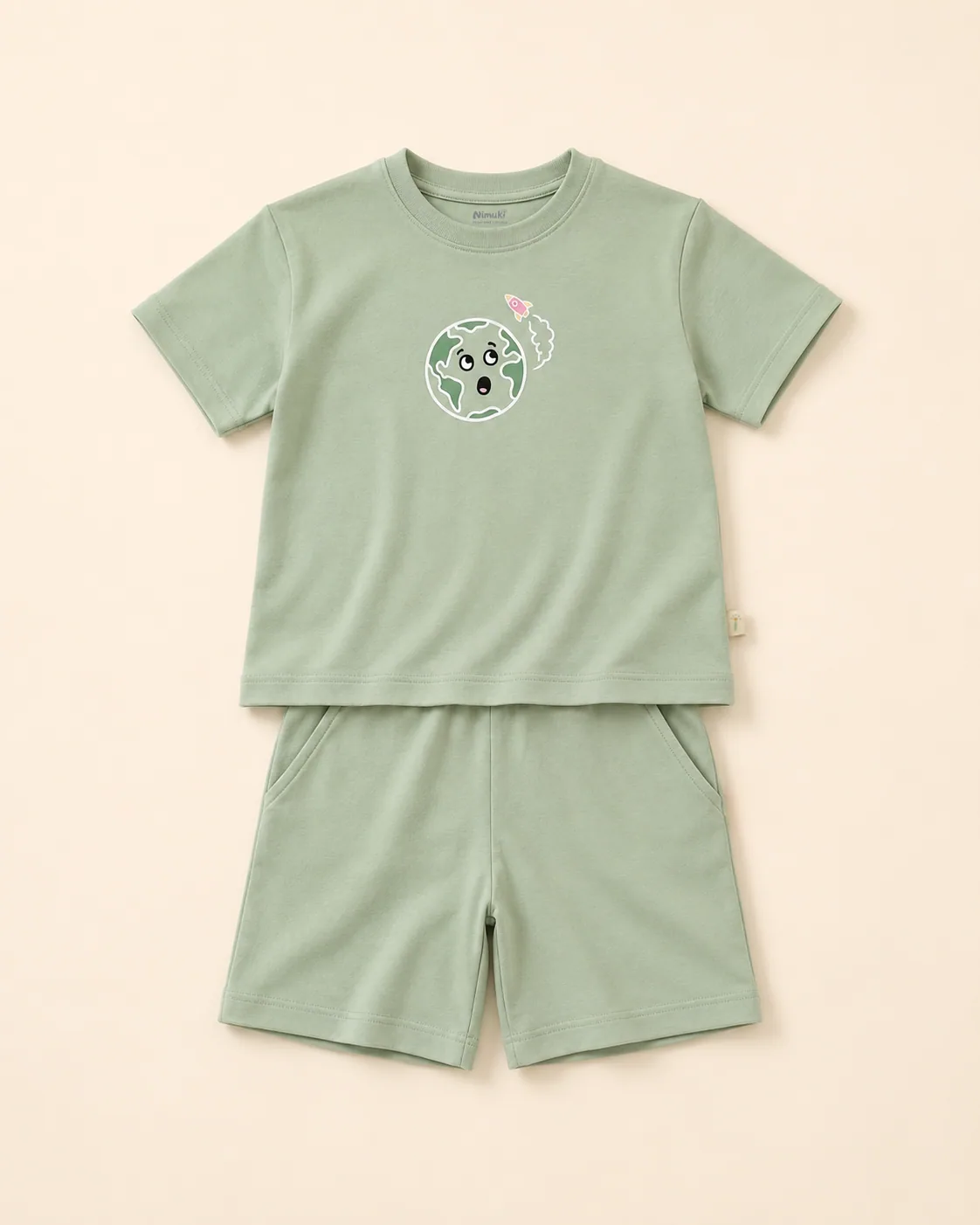
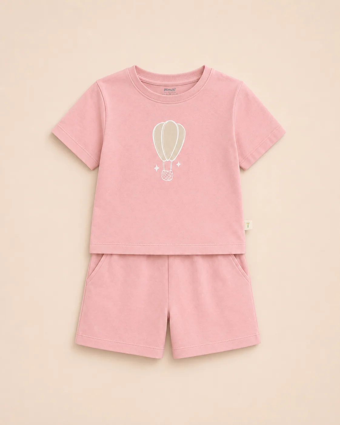
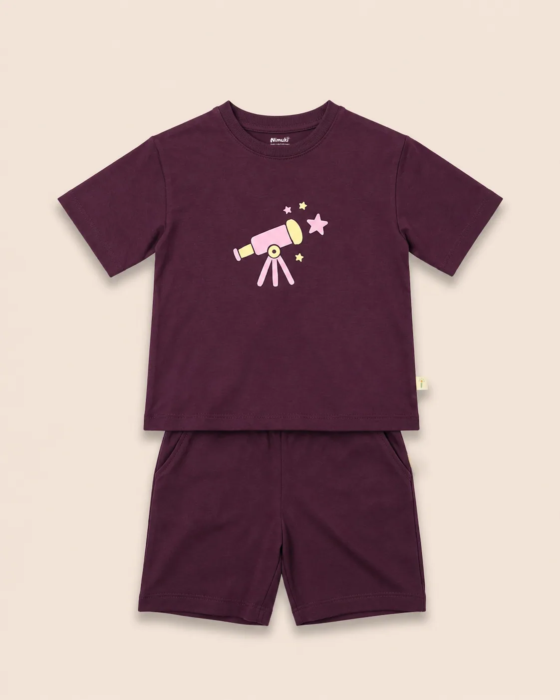
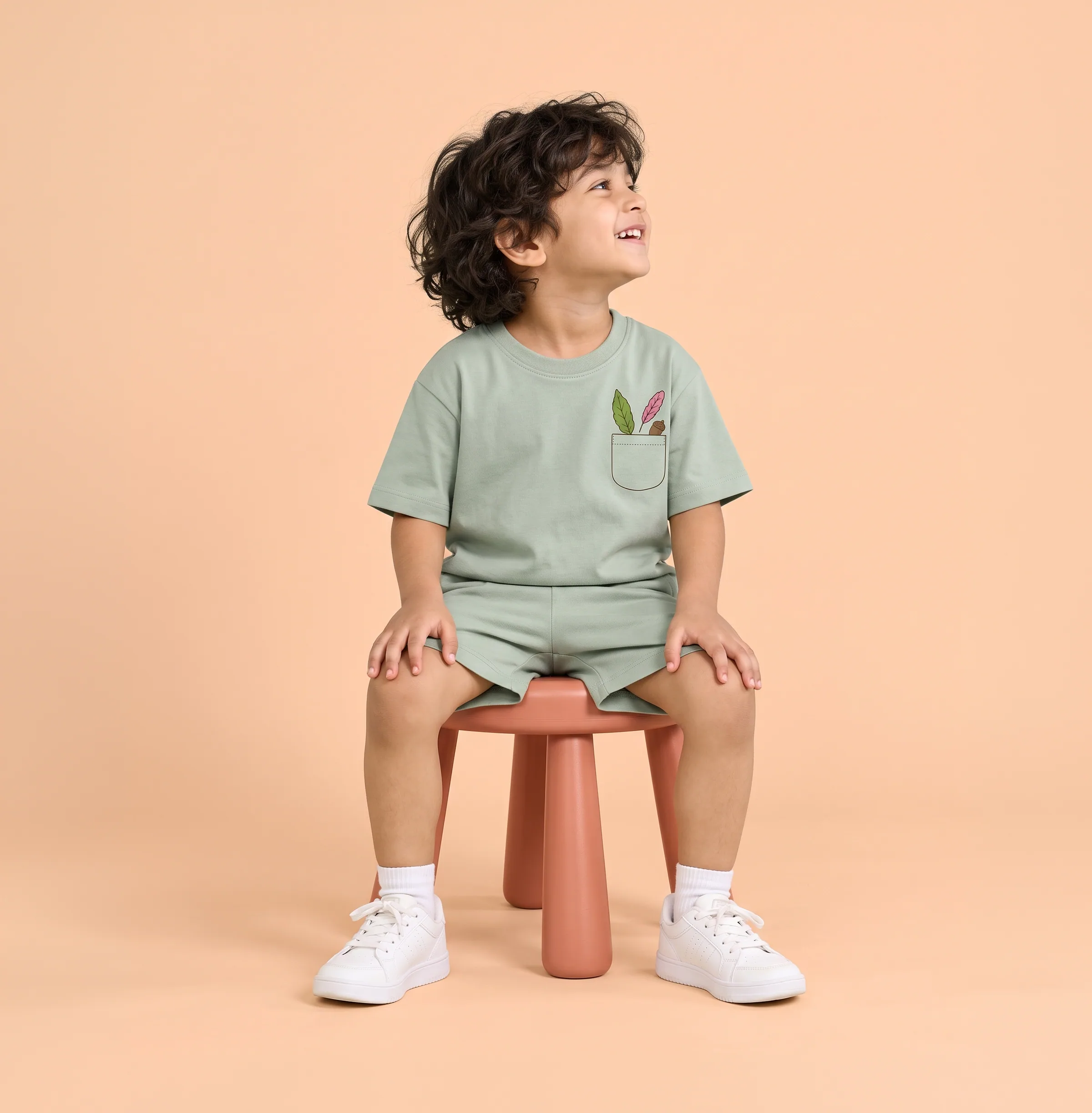
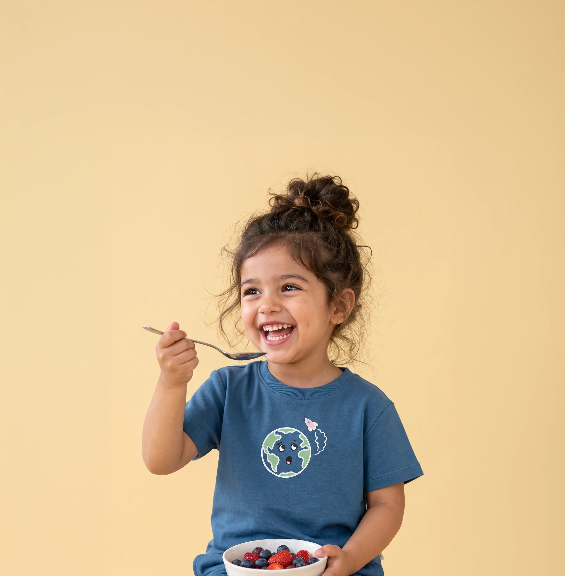
On the clothes, the artwork does the talking: a wide-eyed little Earth, a hot air balloon, a telescope pointed at the stars. Each one is drawn to feel like something a child found, not something a brand put there.
- Brand Identity
- Logo Design
- Packaging Design
- Clothing Artwork
- Labels
- Social Media
Playful by heart.